Trick #1: Forced Perspective

Objects can be made to look larger, smaller, closer, or
farther than they really are. The guy playing the leprechaun looks small
in the right picture because he is sitting on a large replica of a pot
and holding oversized coins. The large fake shovel helps. The left image
is trickier. The leprechaun is actually sitting much farther away from
the camera, but the set is built making the table he is sitting on look
like the same table the other man is leaning on. It appears that they
are the same distance from the camera with him smaller.
Recent
movies like the Lord of the Rings and Harry Potter use similar tricks
to make their characters look larger or smaller than they really are.

Forced perspective is aided when the far object seems to be in the contact with the closer item. In this picture it is easier for us to believe the man is standing on a large Coke bottle (or he is small and the bottle is normal size) rather than thinking the man is far behind the Coke bottle. These are called "in camera" tricks because a photographer can create this trick without having to retouch the photo later. You can do this with your cameras (video, film, or digital).
Again, the clues in a picture (like his foot touching the bottle cap) can make us interpret something much different than reality.

Disney World in Florida had a height restriction for their Cinderella's Castle. So they used forced perspective to make it look taller. As tourists we assume that the lower windows and the upper windows are the same size but the upper ones look smaller because they are high up on the castle. It is true the higher ones would look smaller, but upper windows were purposely made smaller than the lower windows forcing us to interpret the castle as being taller than it actually is.

We've all seen westerns where the cowboy enters the saloon through the front door. Movie makers use forced perspective to fool us in interpreting the height of the different characters. For characters who are suppose to seem big and tall, they shoot the scene with a door that is much shorter making that person appear taller. The scene is edited to make us think it's the same door, but it isn't.
Also, a leading man can be made to look tall compared to the leading lady even if she is the same height by making one side of the door taller than the other. The man stands on the shorter side. Roll mouse over image to see altered door. The camera is placed closer to the short side of the door making that side of the door seem taller. At an angle the door can be made to look square. The man can appear to be a few inches taller.
Many of our shorter leading men actors have been made to look taller using these techniques.


Trick #2: Illusion of
More

Empty Top: Packages that contain more expensive items will often just let you see through the bottom portion of the package. Consumers will think the contents fill the whole package but it doesn't.
Trick #3: Sell air for
big profit

Air at $361 per pound: Ice cream manufactures love to promote their "light" ice cream. They promote it as having less fat and fewer calories, but they never mention that's mostly because air is added. All ice cream has a certain amount of air added. Some have only 10% air, but others can increase their volume by 100%. They call this "overrun". So a gallon of ice cream can be a half a gallon of ice cream and half a gallon of air. At $4 for the carton, you are paying $2 for the half gallon of air.
This half gallon of air weighs about 2.5 grams.
$2 x
454 grams = $361
2.5 grams pound pound
Multiplying $2 per 2.5 grams times 454 grams per pound gives us $361 per
pound (grams cancel). Note: Ice cream is sold by
volume and there's no requirement for showing how
much air is in the ice cream.

Air at $2,625 per pound!: Yogurt manufactures have also made products that are whipped with air. At least these are sold by weight so the consumer can know how much air is present. Here is Yoplait Original that weighs 6 ounces and Yoplait Whips that weighs 4 ounces. They have the same volume which means Yoplait Whips have 1/3 of its volume as air. I measured the volume and it was 120 milliliters. That means 1/3 of the 120 milliliters (or 40 mL) is air. Both cost about 90 cents so that means 1/3 of the 90 cents (30 cents) went to buying 40 ml of air.
It takes about 350,000 ml of air to weigh a pound. So
$0.30 x 350,000 ml = $2,625 per lb
40mL
lb.
That's 14 times more expensive than silver and only about 1/3 the cost of gold. You can see why manufacturers love to sell the "light" or "whipped" versions of their products.
Trick #4: Altered Versions
of Familiar Items.

We are all familiar with glass and we know how hard it is plus we know that it can cut us. So that's why we are impressed when an actor jumps through a glass window or gets hit on the head with a glass bottle.
Hollywood has made this stunt safer by not using glass but sheets of sugar or, more recently, silicone glass (also called rubber glass). You've heard of silicone rubber sealant. It's a form of that.
There's many items now made from this glass look-alike.
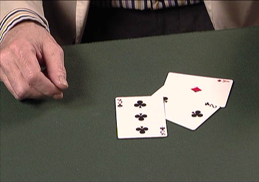
Card tricks depend not only on slight of hand but on specially designed cards like "gaffed" cards (altered decks). The common altered decks are the Svengali Deck, Stripper Deck, Invisible Card Deck, Brainwave Deck, and more. I don't want to reveal how these decks work, but they all take advantage of the fact that we are familiar with playing cards.
Trick #5: Product
Placement

In the past and now, commercials and advertising are usually easy to spot. To sellers that's a problem because buyers can dismiss it as just an advertisement. Consumers often try to skip over the commercials.
A more subtle form of advertising is product placement. It can promote a product without the consumer's brain turning on the defense mechanisms that it usually does when it sees a commercial.
Companies like to place products in movies because it the audience is in a mode of absorbing the images and story of the movie. Plus, the audience can't fast forward through anything that seems like advertising.
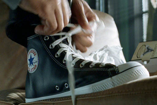
In the movie, iROBOT, Will Smith's character gets his new "vintage" Converse sneaker and calls them, "A thing of beauty." Later in the movie, Will's boss compliments him on the shoes. This wasn't subtle and has been criticized for blatant product placement. For me, it nearly ruined an otherwise good movie.
A futuristic Audi was also featured in the movie but there wasn't any extraneous comments about it. (roll cursor over image to see it).
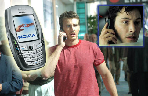
The movie, Cellular, is basically one long commercial for the Nokia phone. There's a line in the movie saying, “This is the single greatest phone ever made.”
Another Nokia phone was made more popular by product placement in the movie, Matrix.

Imagine walking along to class and you overhear some people talking about a great new music CD. Later that day, you see someone with the CD laying on top of their textbooks. To you it seems that your peers have discovered something new and hot, so you buy the CD. Unfortunately, you may have been a victim of a very deceptive form of product placement where people are hired to brag about a product in public. Those around these hired actors are easily fooled in thinking they are hearing an honest judgment of the product.
Trick #6: The Audience
Plant (Audience Stooge)
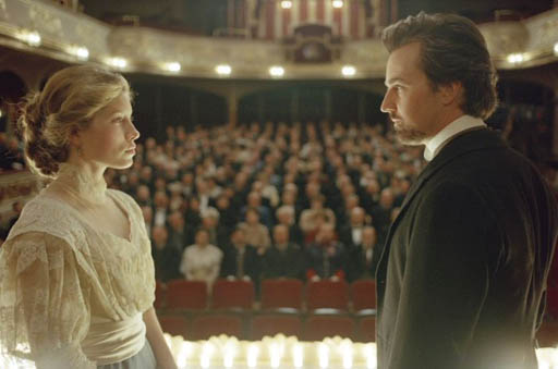
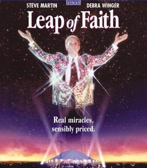
In the movie, Leap of Faith, Steve Martin would use audience plants to listen in on people's conversations. That information was passed on to Steve Martin so he could appear to have divine knowledge. Some plants would even place money into the audience pockets so that they could witness a "miracle." The movie borrowed heavily from a book, The Faith Healers, by magician James Randi that investigated certain faith healers and discovered the many tricks that were used.


Laugh Track: The laugh track is a form of an audience plant. When you hear a laugh track you are suppose to be thinking that the audience (including yourself) should be laughing. The creator of the M*A*S*H series did not want a laugh track but had to compromise to CBS by letting it be used outside of the operating room scenes. The DVD of the series allows you to turn off the laugh track.

For live audiences like at comedy clubs or live TV shows, there are stories of people hired to be there because they had such an infectious laugh.
I had a student in one of my classes who reacted noticeably to my jokes or surprises. Her reaction got the whole class to react. I had wished she was in all my classes.
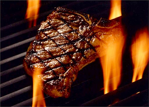
Trick #7: Sell the Sizzle, Not the Steak

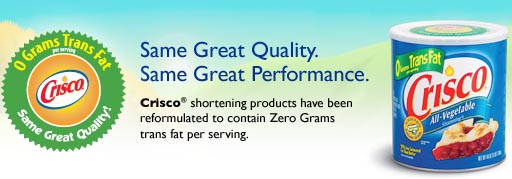
Trick #8: Art of Hiding


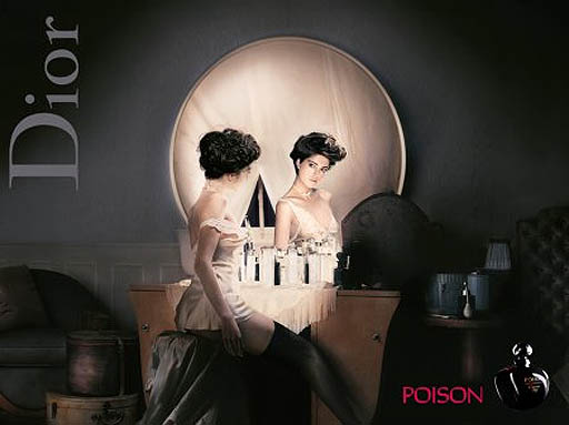
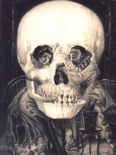
Trick #9: Use the
Power of Suggestion



I love the image used to sell their mustard. Here is the
text,
"Add a little spice to your life with Wild Oats certified organic
mustard! 100% fat and cholesterol free; no artificial colors, flavors,
or preservatives."
It's funny that a person eating a hot dog and potato chips would be worried about fat in the mustard.
The suggestion here is that eating hot dogs and potato chips are OK if your mustard has no cholesterol or fat.
